ShopDreamUp AI ArtDreamUp
Deviation Actions


Description
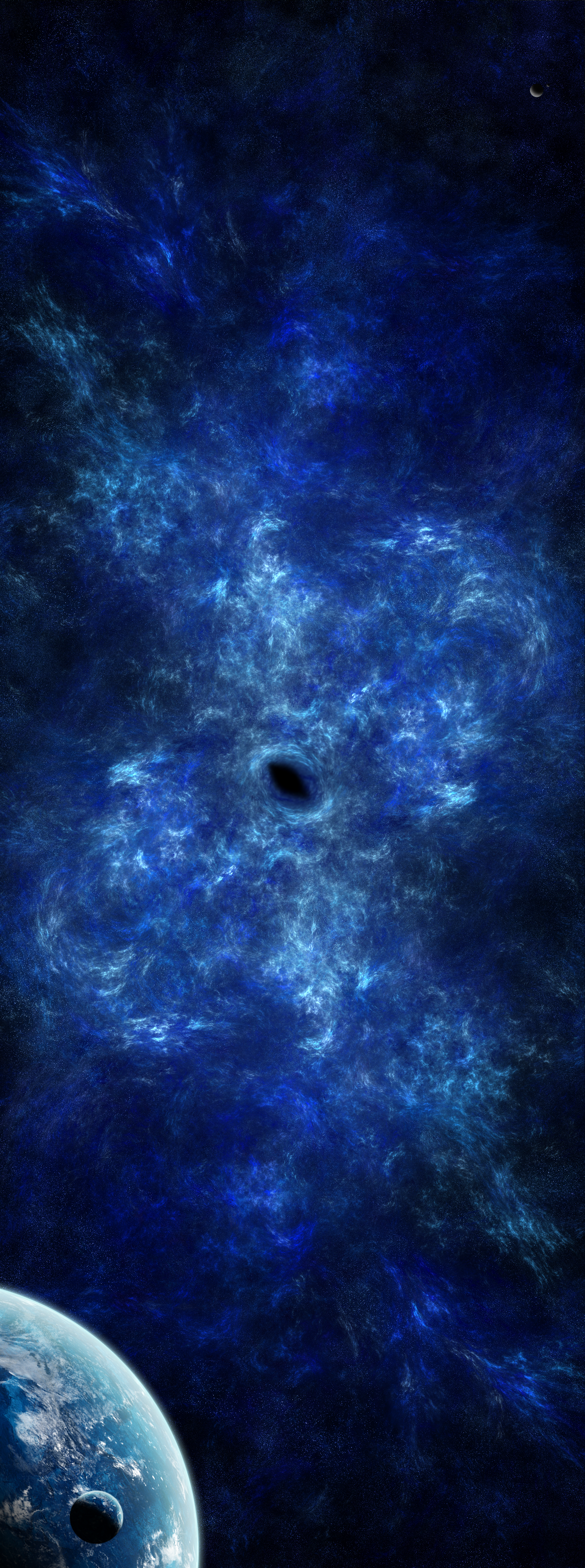
Located in the Tri-Sector system, the Blue Sector is just as scientifically astounding as the rest of the system. At it's heart are the radioactive remains of a blue hypergiant star after it reached the end of it's life over 2 billion years ago. This radioactivity causes the stars seen behind the gas cloud to have a distinct icy-blue tint to them. The enormous force of the star's explosion, far greater than should be possible, forced out giant shockwaves of gas far into space, and at the center of this gas cloud is a black hole, formed when the star died.
Between the overly powerful, outword force and the extremely powerful gravitational force provided by the black hole, new stars are forming in the gas cloud which has been practically immobile for close to 1.8 billion years.
This planet, shown at the bottom left, was created by the ancient and powerful civilization known as the Valkyries, to monitor the anomaly and record any side-effects on the people living there.
With the Valkyrie long gone, human research teams are attempting to piece together all of the findings. It seems that the planet was originally created to be a rocky planet, but soon the effects of the radiation seemed to somehow dye both the rocks of the planet, and the population, blue. No medical damage seems to have been caused, but ever person's skin, blood and bones turned blue within just 200 years. Also, plants grown in the blue soil seem to have additional nutritional values, which would help explain why the rest of the Valkyrie race named them "The Ice Giants of Niflheim". In fact, this sector was codenamed Niflhiem, which was the Norse mythological world of ice. Which begs the question, why did an ancient alien civilization name a blue region of space the same as the Norse named the Ice world of Hell?
----------------------------------------------------------------------------
OK, there you go, hope you had fun reading (Smile)")
This is the third piece of my Tri-Sector story I've posted, with only one to go
So anyway, if you want to read about the real Niflhiem, wikipedia is your friend [link]")
Feedback is apreciated") And thanks for reading
And thanks for reading
Story prologue: [link]
Green Sector: [link]
Violet Sector: Coming soon...
Sigma Sector: [link]
Between the overly powerful, outword force and the extremely powerful gravitational force provided by the black hole, new stars are forming in the gas cloud which has been practically immobile for close to 1.8 billion years.
This planet, shown at the bottom left, was created by the ancient and powerful civilization known as the Valkyries, to monitor the anomaly and record any side-effects on the people living there.
With the Valkyrie long gone, human research teams are attempting to piece together all of the findings. It seems that the planet was originally created to be a rocky planet, but soon the effects of the radiation seemed to somehow dye both the rocks of the planet, and the population, blue. No medical damage seems to have been caused, but ever person's skin, blood and bones turned blue within just 200 years. Also, plants grown in the blue soil seem to have additional nutritional values, which would help explain why the rest of the Valkyrie race named them "The Ice Giants of Niflheim". In fact, this sector was codenamed Niflhiem, which was the Norse mythological world of ice. Which begs the question, why did an ancient alien civilization name a blue region of space the same as the Norse named the Ice world of Hell?
----------------------------------------------------------------------------
OK, there you go, hope you had fun reading
This is the third piece of my Tri-Sector story I've posted, with only one to go
So anyway, if you want to read about the real Niflhiem, wikipedia is your friend [link]
Feedback is apreciated
Story prologue: [link]
Green Sector: [link]
Violet Sector: Coming soon...
Sigma Sector: [link]
Image size
1193x3200px 7.99 MB
© 2010 - 2024 DexausMelmac
Comments23
Join the community to add your comment. Already a deviant? Log In
I like the texture on the larger planet although I think that it's lit why to much since the light source isn't that close. You should bring the light source closer so it looks more natural for the whole piece, also you have a moon there with the same texture as the planet, you should change it to something different also the smaller the moon/planet the smaller the atmosphere it has, so the moon would have a thiner atmosphere then the larger planet. So giving it a rocky texture would look great, also the bigger the texture you find and the more you can re-size it and make it smaller the better it will look in your piece. Also it's good to make the cloud layer separate from the texture player. So duplicate the cloud texture, the first cloud layer give it a small drop shadow so it gives it a little depth between the texture and the clouds as if the clouds are above the land. The second cloud layer set it to overlay and give it a emboss. That will make the clouds look 3D.
The composition of the piece is a little bit to tall for me as my eyes are going every where, try and make it shorter and bring in the nebula closer to the planet and moon. The nebula isn't very bright so try to ad more players and define the nebula more, make it brighter in the direction of the light that hits the planet. each bit you add to the nebula do in a different layer, that will make it look layered. As for the stars. it looks like just a noise filter, so try to remove some of the finer stars in the background and add some brighter ones with in the bright places of the nebula. (If you are going to make it brighter.) I find that adding the stars outside the nebula where it's really dark helps, it's also good to have some parts of the nebula that are black, that creates good contrast.
But overall I think you have got really good from your other pieces. Nice work and keep it up.